So once you get the traffic, thanks to your blog and your website, you need to invest in strategies that allow you to get contacts with whom to have a conversation. If you want to know how, pay attention and write it down!
Let’s say you are a company in the industry that has a well-crafted website. Let’s take as an example the website from
British Ceramic Tile
. Already its name could not be more explicit: this company is positioned as the largest manufacturer of ceramic tiles in the UK for both B2B and B2C:
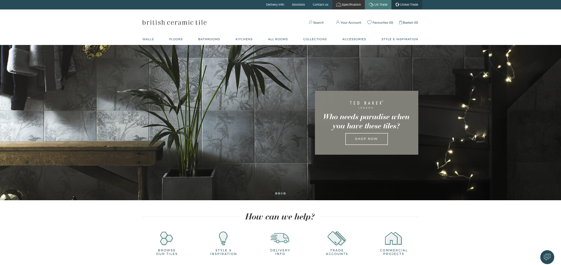
This company has well positioned its website thanks to its keywords work. And, of course, they also have a blog with which they position their content. So if there is someone who is looking for advice, inspiration or information this company provides everything your potential customers need.
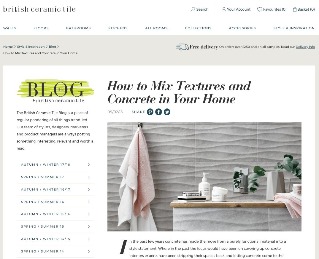
Okay, this was already clear with the previous publication, right? So what’s next? The conversion phase.
In this process, a visitor first clicks on a CTA a button that promotes a type of of content and generally links to a landing page (Landing page), in which he fills out a form with your contact information, which makes the unknown visitor a lead known.
The idea, or rather the objective if we are talking about B2B companies, is to get contacts with whom the commercial team of the materials company can communicate to evaluate a project. In the case of B2C companies in this sector, the objective would be to incite end customers to purchase by sending them information to inspire and motivate them. How can you do it?
1. With calls to action.
To get contacts, users interested in your content (both your blog and your website), you have to be able to get their attention.
What is a call-to-action (CTA)? The call-to-action (found on the web, blogs, emails…) are focused on the Conversion stage of the Inbound Methodology, with the purpose of to obtain sales opportunities (
leads
) that could eventually become customers.. And British Ceramic Tile does this to perfection in its Home:
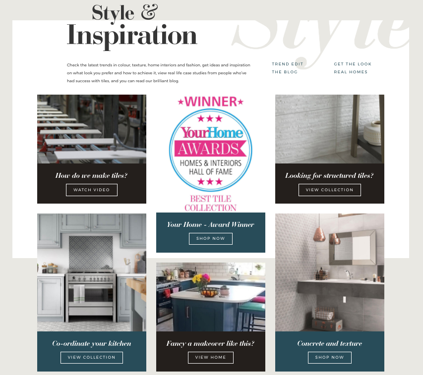
In this case, CTAs are intended for end customers, so keep in mind that, once it is clear to them what kind of product they want, they will not mind clicking on buttons that take them directly to the products. CTAs are your business assets, so it’s important to follow best practices when creating them.
So how do you create effective CTAs?
- Orient them to action. You want your visitors to download a guide, watch a video, go to a catalog, request a consultation, etc. To do so, use short texts and clear and direct action verbs (“Download”, “Register”, “Go to the collection”).
- Include
keywords
consistent with the content being promoted. For example, a CTA in a blog post can incorporate the keyword of the content (eBook or online catalog) that is going to be offered and that is related to that same post. On the pages of your website, CTAs can have calls to other pages, as you see in the example above.
- It attracts attention. Design a CTA that can stand out (and follow your branding) to get visitors to click. Include buttons, links and take into account the preferences (design and navigation) of your potential customers.
- Use a strong and appropriate placement on the page. CTAs must appear to be integrated into the page, that is, they must have a natural and unforced position. They have to be easily noticed, catch the eye and fit logically with the rest of the page. For example, in a publication, the most logical thing to do is to place a CTA at the end, as if it were the next step.
- Test changes and analyze the results. When analyzing the effectiveness of a CTA, you can set a goal of 1-2% click-through rate.
click-throughs
that is, of the people who viewed the content on a page, that percentage clicked on the CTA. Don’t forget to try changing the CTAs, to get to know your buyer’s preferences better.
As we have already mentioned, once they click on a CTA, it redirects the users of your website to another page.
2. The landing page.
What is a landing page? Landing pages are pages that your visitors land on after clicking on a CTA. There are times when you simply want them to see a catalog or expand their information, but when your objective is to get their contact information, these pages are ideal, because are characterized by having a form.
Get information about your web visitors through the forms they fill outallows you to build relationships with your sales opportunities (leads), so that your actual sales reps can focus on the most qualified contacts, i.e. those closest to making a purchase or signing a project.
If we continue with the example of British Ceramic Tile, this company, apart from the CTAs that we have seen before and that are much more direct, contains two very interesting calls to action, both on its blog and on its website that go to micro-sites (specialized sections).

If we click on the second one, we can see one of these specialized pagefor architects, interior designers and builders. It is interesting that the blog in this section is other and is intended only for this particular audience.
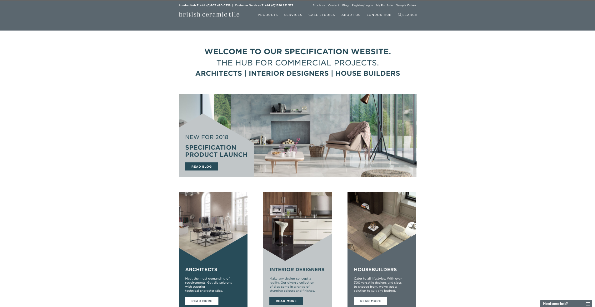
Here there are also other types of CTAs destined to a specific target and if we go to one of them we find a landing page.
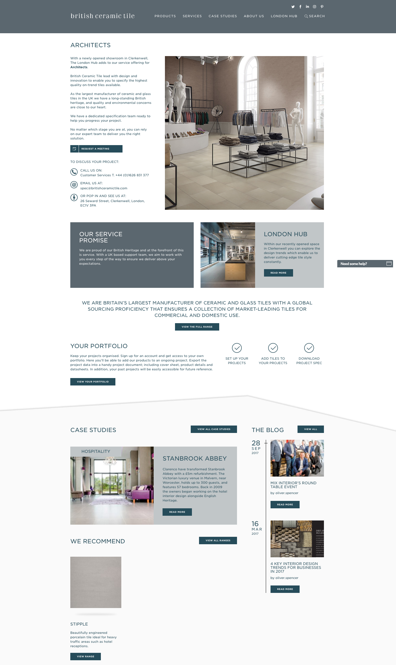
This landing page
has all the information that could be of interest to one of these targets, with success stories and success stories and relevant publications. Content managed in such a way that the interested professional has no doubt about the professionalism of this company. The user has two ways to contact us: directly, as provided at the beginning, or through the contact form.
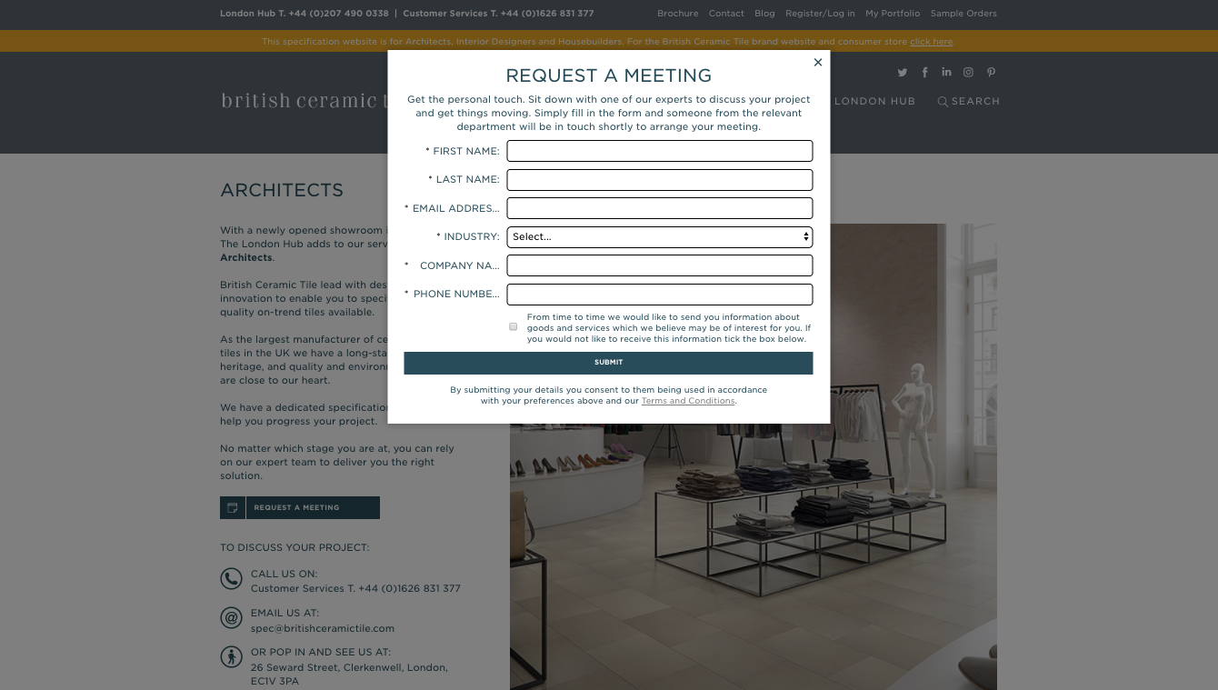
And what should form pages look like?
- If you offer any kind of downloadable, write a clear, concise and action-oriented headline.. Explain to your visitors what they will get, what the benefit of the offer is and how they will access it. Use action verbs such as “download” for an eBook or template, and “watch” for a video. If this page is for professionals (B2B) be sure to highlight who exactly you are targeting, so there is no doubt. exactly, so that there is no doubt.
- Clearly explain the content offering or your commercial offer and visually emphasize the value. highlighting the benefit to be obtained by the potential customer. For end customers of B2C companies it is better to condense the content to avoid scrolling and it is advisable to use numbers, bullets and bold text to make the information more easily digestible. But for B2B companies, as we see in the example, you can give them all the keys (success stories and publications) so that they have no doubt what kind of company you are and trust you before filling out the form or contacting your company.
- In the form you should ask for as much information as is necessary for your objective. Never ask for non-relevant information and make it clear what you will use the information for. You must now take into account the new GDPR regulations.
- Depending on the content offered, it is advisable to remove the navigation menu and links.. Since the main objective of your landing page is to generate sales opportunities it is best to eliminate all distractions. Make sure the submit button is visible and easy to click. If you consider that the person accessing your
landing page
must be very interested, the navigation menu can be optional. - Don’t forget to include a relevant image, an animation or a short video to help visually convey the value of the offers to your visitors.
- Y add social network icons to expand your reach on these platforms and generate more leads. A good way to promote
engagement
.
3. Now, lead to the next step with thank you pages.
The thank you page is the new page that sales opportunities arrive at after filling out the form on the landing page, i.e., where you typically provide the download link for the content offer, if you don’t send it by email. the download link to the content offer, if you don’t send it by email.. Or, you detail when your team will call the new contact if not specified on the form.
It also thankfully provides some additional content about what the sales opportunity wants to see next. The
landing page
finalizes the conversion process and can help new leads to
leads
continue with their buying process and expand their reach on social networks, bringing them closer to becoming a customer.

