Did you know that your website users can evaluate the credibility of the page in as little as 50 milliseconds? And that one out of five visitors will abandon the website, without giving you a second chance? First impressions are very important. The website of your Mallorcan SME is your showcase open to the world 24 hours a day, 365 days a year. Doesn’t that seem like a good enough reason? Here are seven trends to stay on trend.
{{cta(‘bb2971b9-bf36-4c36-8edc-75223dba5208’)}}
1. Captivating photographs
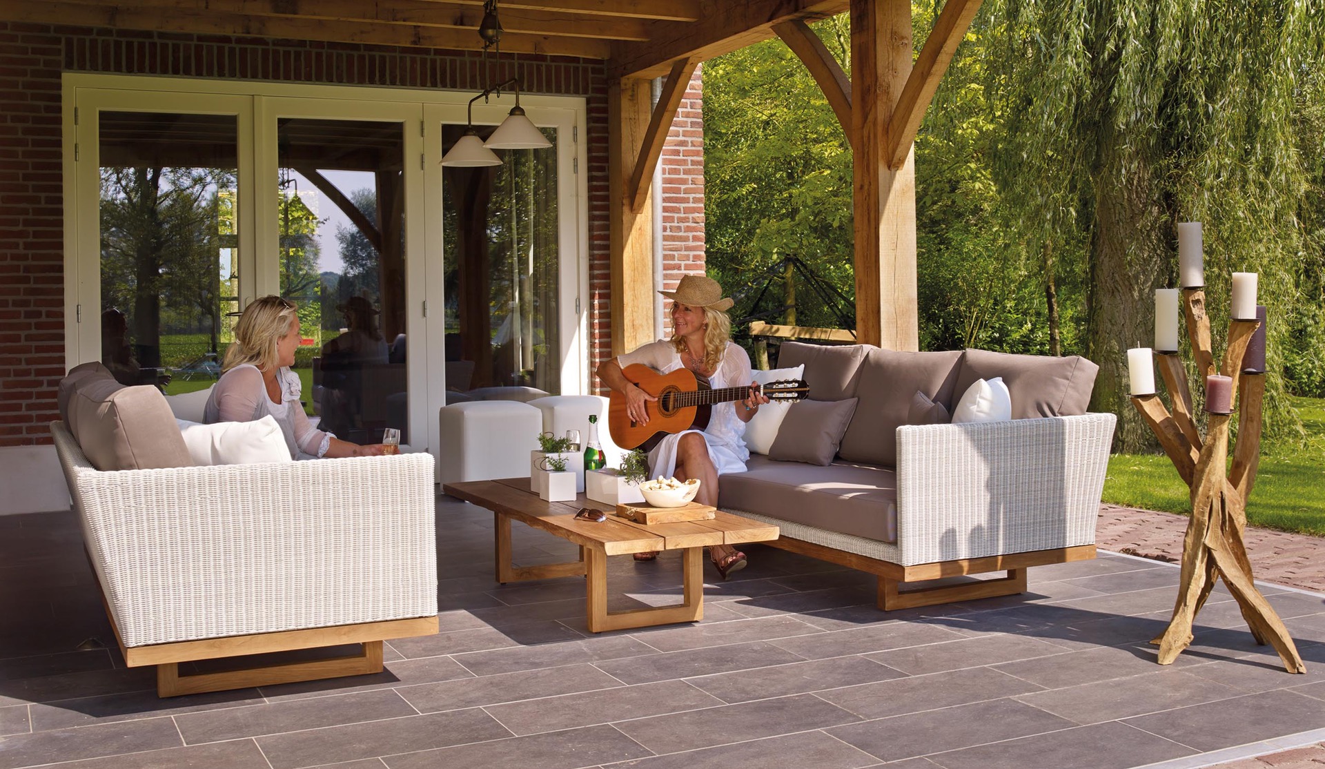
Use large-format, quality images that are attractive and show experiences. Captivating images. A photograph is usually the first thing a web surfer’s eyes see when they open your website. The choice of a photo is key.
Choose images that inspire and connect with your buyer persona. For example, if you sell furniture, don’t just put a picture of a sofa on a white background. Use a photograph showing a family gathered together and sitting on the couch laughing and enjoying the moment, or a couch next to a fireplace with a blanket folded in one corner. In short, images that speak not only of the product but also of the experience.

2. Videos that inspire
Videos are a key piece for your website. They are a very attractive way to offer content, besides being an element that helps to better position your website in searches.
A video placed in the home page of a website can tell a lot of things in a few seconds. Experts say that our brain processes 60,000 times faster the information of a video than that of a text, and that we retain 65 percent of the visual message versus 15 percent of the written message. We tell you about it in our post 4 reasons to include video marketing in your SME.
Watch this video located at Phone Jacks’ homepage about their product: a cell phone charger. Their website has been nominated by the Awwwards, an academy that recognizes the talent and effort of the best agency web designs from around the world. In half a minute he explains the product and the experiences involved. You’re sure to love it!
3. Cinemagraphs that seduce
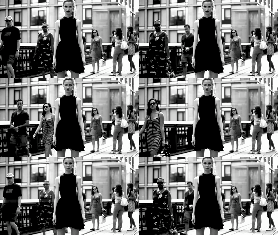
Do you know the cinemagraphs? I’m sure you’ve seen more than one. They are a mix of photo and video. In reality, it is a photo with one or two moving elements that stand out and attract attention. Today it is a resource also used in webs, but be careful, it must maintain the same style as the rest. A cinemagraphy fits in a website with a modern, attractive and eye-catching design.
It is a resource that also improves positioning and captures attention.

4. Numbers that persuade
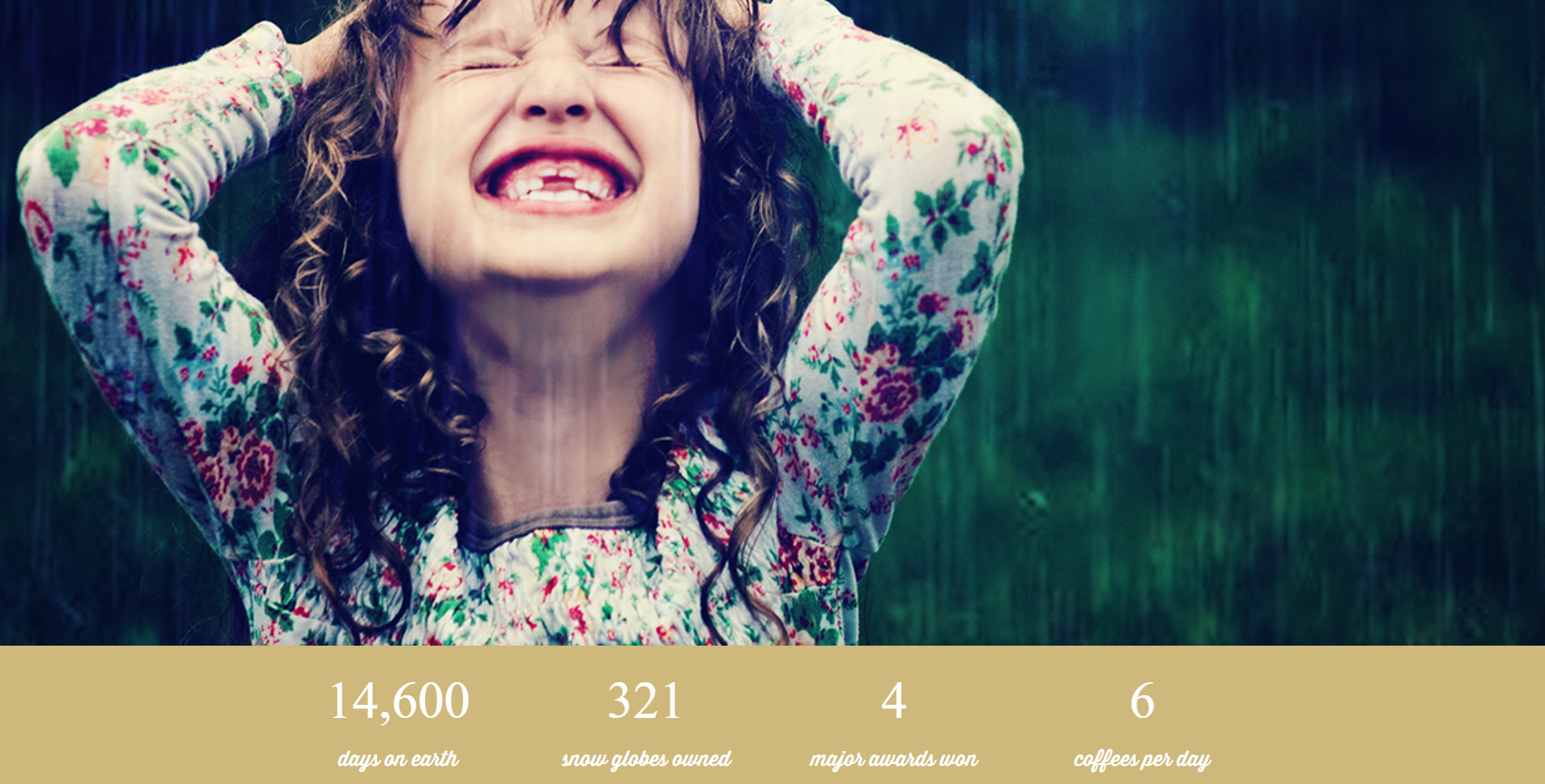
The numbers project confidence. An architect who has managed 20 projects is presented as more competent than one who has “many years of experience in the sector”. A company with operating centers in 4 different countries seems more stable than one with an “international presence”. Even when the numbers are not very significant, being precise and specific also works.
Conveys strength in numbers. It is a way to persuade by reflecting credibility and being concrete, simple and direct.

5. Conquering navigation
Navigation also tends to “austerity”. Make it simple and intuitive. Fancy stuff is out of fashion, fortunately!
Infinite scrolls are the latest trend. Visible, witty and attractive scrolls. The single menu bar is always present (sticky menu), preferably narrow, horizontal and in the top band, even when users scroll to the footer. The menu options also tend to be minimized, with a maximum of 5 sections.
6. Copy that attracts
Now the trend is to use direct, light text, with precise information and no frills. Overlaying images, or even video, with text is very attractive.
But what should you take into account to get the copy right? The basis for success is, without a doubt, your buyer persona. Think like him, put yourself in his shoes and imagine what information he would like to have once he enters your website and how, in what tone, he would like to read it.
Don’t stick with the first version. It is a very, very important text that you must think about carefully. A simple comma, a simple period or a simple adjective can lose the interest of your Internet users.
7. Design that makes you fall in love
More and more companies are hiring illustrators and graphic designers to create custom images for their websites. After years of flat, minimalist designs, adding touches of unique artwork is a great way to add personality.
Bet on geometric lines and play with symmetry. Strident colors are also the latest trend and, above all, with curious gradients.
Impress your audience and make sure that when they enter your website they get a very good impression. Even if you run a small business in Mallorca, your website is the image of your business and has international projection. It is well worth the time and effort. Now you know what’s hot!

