#1 Flat Design
The success of Flat design – flat design – in 2017-.2018 was unstoppable, and simple and clean websites became a worldwide trend. Simply put, Flat design is a style in which the elements give a perception of only two dimensions: they are “flat”. They have no shadows or 3D elements.
Due to the need to adapt to mobile devices, flat design has not only proven to be an excellent option for optimizing better mobile performance, but also a perfect way to elevate the UX of a website. Clean design is the best way to make your website easy to understand, to make sure your site structure is clear and understandable, and that your user is not confused by the abundance of text and images.
{{cta(‘bb2971b9-bf36-4c36-8edc-75223dba5208’)}}
Flat design has become even more popular with the advancements of SEO. Although Google’s algorithms are changing, they are doing so with the quest for a better user experience, and a fast-loading flat design can make your website desirable to Google, Bing and other search engines, as it helps meet speed requirements and promises a user-friendly interface.
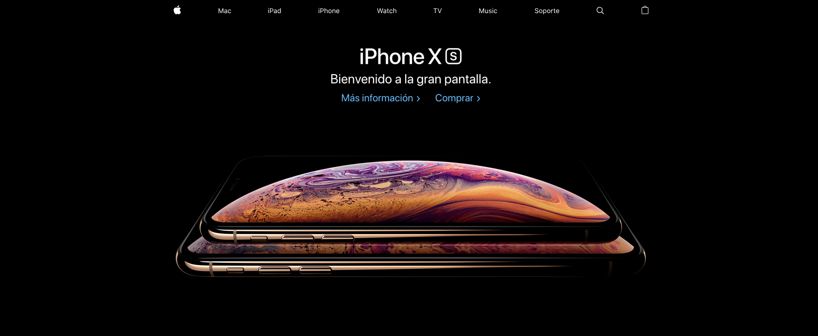
Apple was one of the first companies to switch to flat design, doing so in 2013. Since then, Apple hasn’t abandoned this style, adapting it to new trends, but keeping it simple either way.

Source: www.apple.com/es/
Semi-flat designor semi-flat is an alteration of flat design, where some elements have some 3D features. It can be incorporated into the first-look version of the website or implemented with simple animations.
#2 Dramatic typography
As the style of websites becomes simpler and cleaner, typography becomes bolder. Big, bold fonts do a great job of anchoring your home pages. Most companies have a unique font or typeface that identifies their brand. Now, designers tend to expand titles and embrace this particular font, increasing the association with the brand and creating balance on a minimalist, tidy website.
Typography is a powerful visual tool that adds to your brand’s personality, evokes emotion and sets the tone of your website. The use of custom fonts is now causing many browsers to be able to support hand-crafted fonts that are CSS-enabled for web browsers. When creating your company identity, you can now design custom typography that best supports your brand vision.
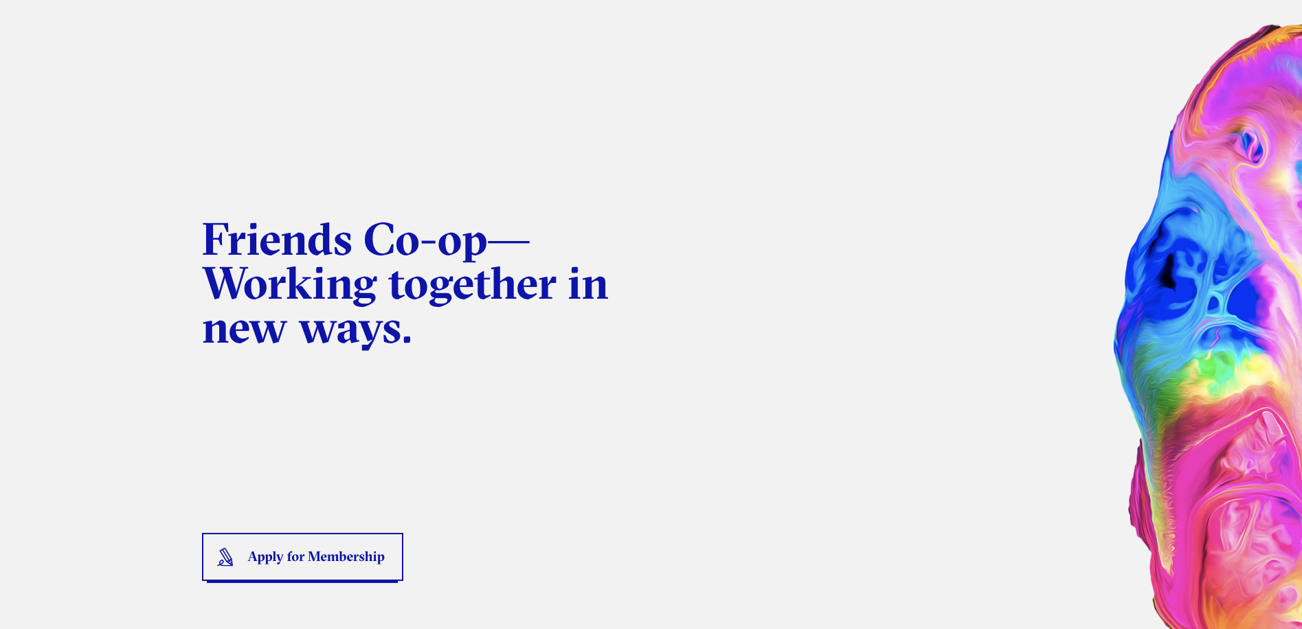
Friends has unique typography that is guiding a user through the website, creating a balanced and complete design of a strong identity. They use large, bold fonts to draw attention to titles and create harmony in a flatly designed website.

Friends: https://bff.co/co/co-op/
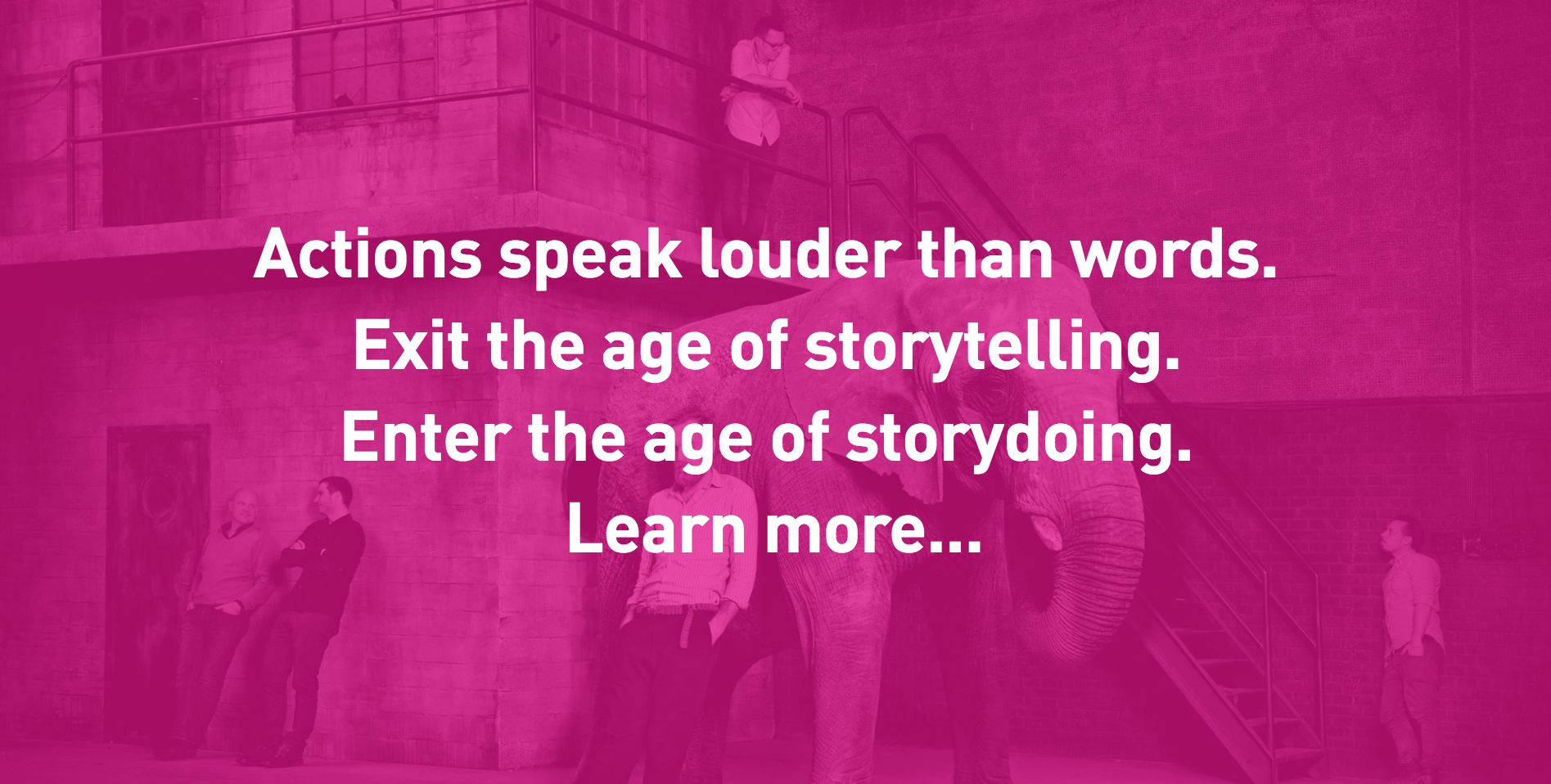
Danish agency CP + B Copenhagencommunicates a strong message with its typography and adds to the experience with bright colors overlaying the image.


