1. Why responsive web design is essential?
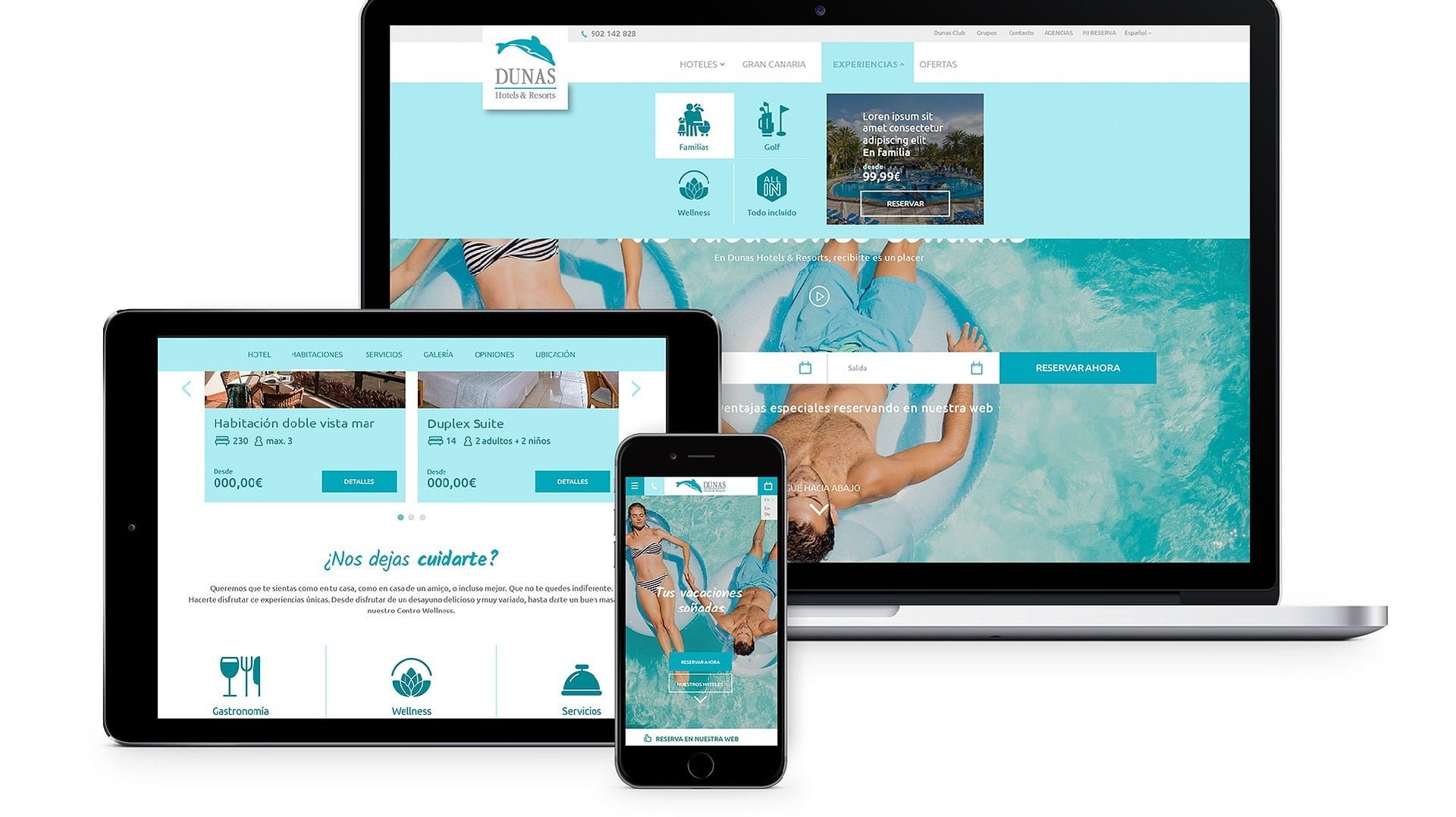
You probably already know that the responsive is the technique used to adapt the contents of a web page to any type of screen format automatically. With this type of development, it is not necessary to make different versions of a website, since the elements are automatically resized from it.
And this technique has been growing more and more. In fact, already in 2015 Google decided to change the algorithms of its search engine – including Mobilegeddon – to give priority positioning to those websites that had a design adapted to mobile. So from then on many businesses, especially tourist ones, raised a change in their website.
However, even today there are hotel websites that have not adapted their content to smaller screen sizes. Websites that may be losing positioning because Google only rewards websites with optimal navigability in all formats. Think that the user experience on any device is fundamental for the search engine. Losing positioning is more than enough reason to change your website to a responsive format .
{{cta(‘bb2971b9-bf36-4c36-8edc-75223dba5208’)}}
2. The importance of Mobile First for your website
With a responsive design the user browsing your hotel’s website will be able to perfectly visualize all its contents – text, image and video – and access all the available functionalities. Because responsive design makes it possible for navigation to be fluid to achieve the best possible user experience, whatever device is used.
But what is this device?
Consumers today spend more than five hours a day using their smartphones. And how does this impact the tourism sector? According to a study by Sojern Global Travel Insights 47% of travel searches in Europe; 40% in Asia; 38% in the Middle East and Africa; 34% in Latin Americaand 26% in the U.S. were conducted from mobile devices in the fourth quarter of last year.

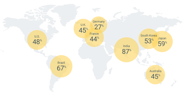
Source: Google. Data on the percentage of users who search, plan and book using only their mobile devices.
In addition, and according to studies by Google, smartphones have a great influence on the traveler’s journeyof travel consumers. And is that mobile devices are increasingly used to research about the destination and the attractions or points of interest that can be made, to locate shopping areas and restaurants, or to search for directions.
On the other hand, when it comes to booking it is true that the experience on all devices influences. But have you thought about whether your website and booking engine are sufficiently adapted? Only 44% of British consumers are satisfied with the usability of hotel websites on mobile devices, for example. And think that when the booking process gets complicated, you can lose your lead.

Source: Google. Data on the percentage of users who find booking hotels on their mobile devices easy.
Why should you think mobile first?
The Mobile First philosophy for design and programming arises with the idea of satisfying users’ need to clearly see all content on smaller screen sizes. That is, this ideology suggests that when designing the website of your hotel, first develop the design for the smallest screen.
And is that this approach to web design takes into account that lthe most complex screen is that of a Smartphone. For this reason it must be prioritized, to be able to apply the essential elements and functionalities and that the user experience is optimal, following a principle of.

